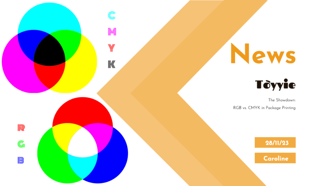
🎨 RGB vs. CMYK: Critical Packaging Color Modes: Understanding the fundamental differences between RGB and CMYK color spaces is crucial for achieving precise color fidelity in packaging printing for designer toys.
At TOYYIE, a leader in premium toy manufacturing, we emphasize the importance of selecting the correct color mode for packaging customization. Leveraging CMYK color profiles ensures optimal print quality and accurate color reproduction for your designer toy packaging.
Understanding Color Modes in Packaging Printing 🖥️🎨
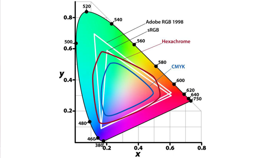

Fig 1: Color gamut ranges showing sRGB, AdobeRGB, and CMYK
| Color Mode | Primary Use | Color Gamut Range | Typical Application |
|---|---|---|---|
| RGB (AdobeRGB) | Digital displays, monitors | Wide gamut covering millions of colors | Design previews, digital assets |
| sRGB | Standard digital display | Smaller gamut than AdobeRGB | Web images, general digital use |
| CMYK | 4-color process printing | Smaller gamut limited by ink properties | Packaging printing, offset and digital print |
| Pantone Matching System | Spot color printing | Specific color matching | Brand logos, precise color control |
| Hexachrome (Extended CMYK) | Expanded printing gamut | Larger gamut than CMYK | Specialty packaging printing |
| Spot UV & Foil | Surface finish effects | No color gamut, applied post-print | Premium packaging accents |
Color Space Fundamentals
The RGB color model operates on an additive principle optimized for light-emitting devices, offering a significantly larger color gamut compared to CMYK. In contrast, CMYK is a subtractive color model used in printing, constrained by ink absorption and paper characteristics, resulting in a reduced gamut.
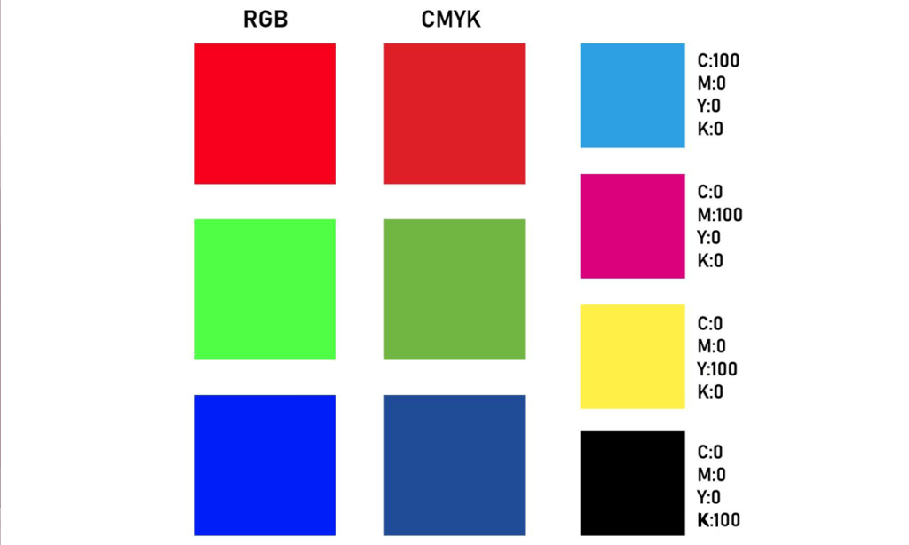

Fig 2: RGB colors vs. CMYK gamut warning and automatic color correction
TOYYIE Insight: Utilizing the ISO 12647-2:2013 standard for offset printing color management ensures consistency in CMYK outputs, reducing variance across print runs and improving color fidelity for toy packaging.
Gamut Limitations and Out-of-Gamut Colors
When converting from RGB to CMYK, many highly saturated colors fall outside the printable range, triggering an Out of Gamut warning in professional design software. These colors are automatically adjusted to the closest reproducible hue, often resulting in muted or altered tones critical to packaging aesthetics.
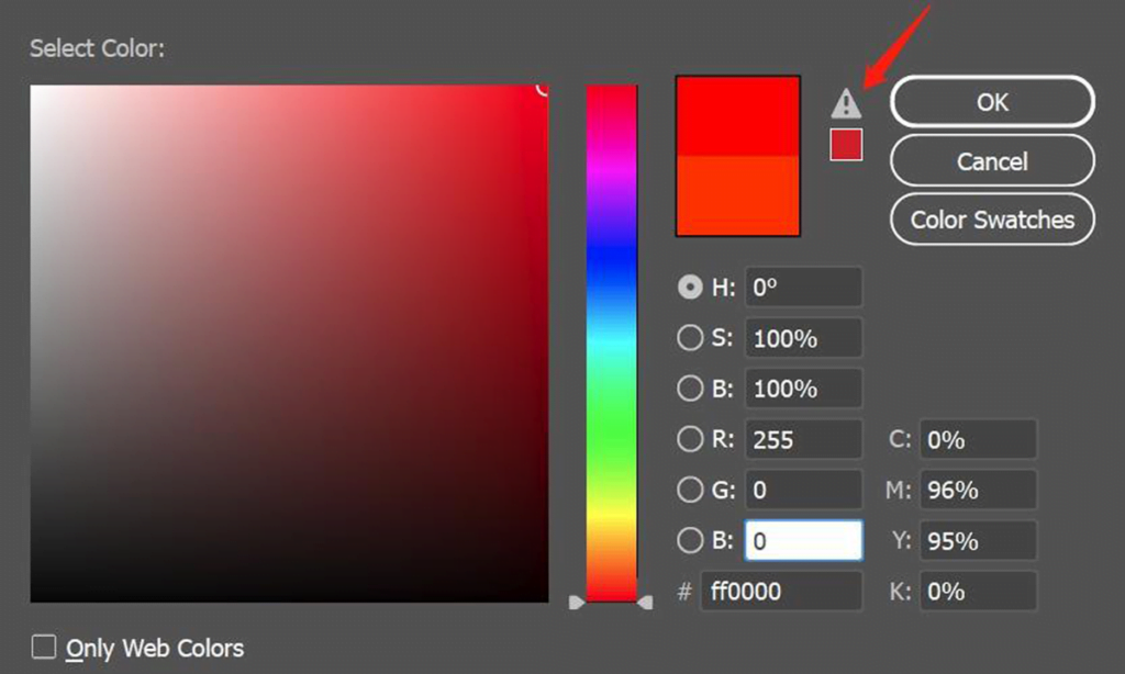

Fig 3: Printed results showcasing RGB and CMYK color shifts
TOYYIE Insight: TOYYIE’s quality control includes ASTM D4236 compliance to verify that packaging inks are safe and non-toxic, critical for collectible and designer toy packaging.
Practical Implications for Toy Packaging
TOYYIE recommends providing packaging artwork in CMYK values to ensure color accuracy during the printing process. Failure to adhere to this can lead to noticeable color shifts, especially in vibrant tones like reds and blues, which may affect brand perception and product appeal.
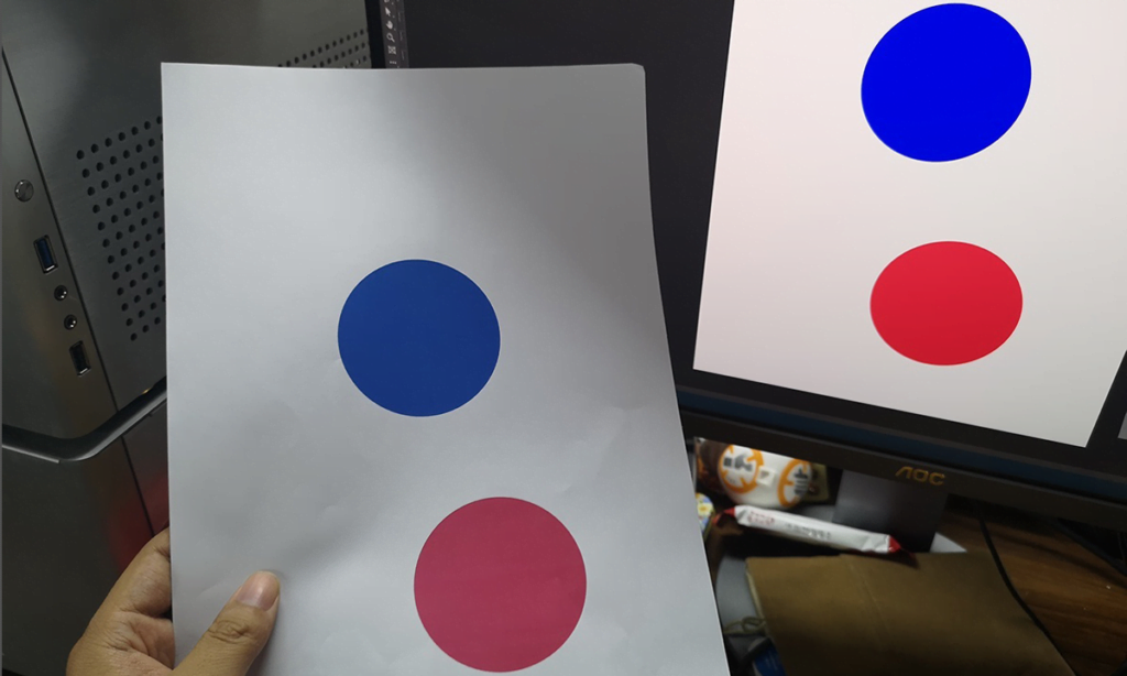

Fig 4: CMYK export preview and printed color accuracy
Printing Process and Equipment Considerations
Color accuracy is influenced by the printer’s technology, ink formulation, and substrate. Standard CMYK printers may produce cooler reds or shifted purples, as demonstrated in tests, emphasizing the importance of selecting high-quality printing partners and performing test prints before mass production.
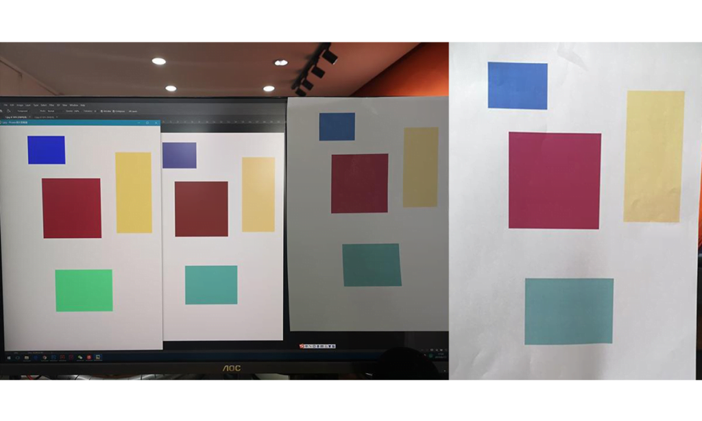

Fig 5: Detailed photo of printed packaging samples with color deviations
Design for Manufacturability (DFM) Recommendations
To optimize packaging print quality, designers should work within the CMYK gamut constraints from the outset, use industry-standard color profiles (e.g., ISO Coated v2), and collaborate closely with TOYYIE’s technical team to refine artwork for consistent and reliable print reproduction.
TOYYIE’s Packaging Printing Capabilities and Quality Standards
- Advanced Color Management: Implementation of ICC profiles and pre-press soft-proofing
- High-Precision Printing: Use of state-of-the-art CMYK and spot color presses
- Material Compatibility: Expertise in coated, uncoated, and specialty substrates
- Color Accuracy Verification: Spectrophotometer-based color measurement and adjustments
- Compliance: Adherence to EN71 toy safety standards and environmental regulations
Partner with TOYYIE for Premium Toy Packaging
Leverage our expertise in CMYK printing and packaging customization to elevate your designer toy’s shelf appeal with precise color fidelity and quality assurance.
Contact TOYYIE for Technical Consultation →

